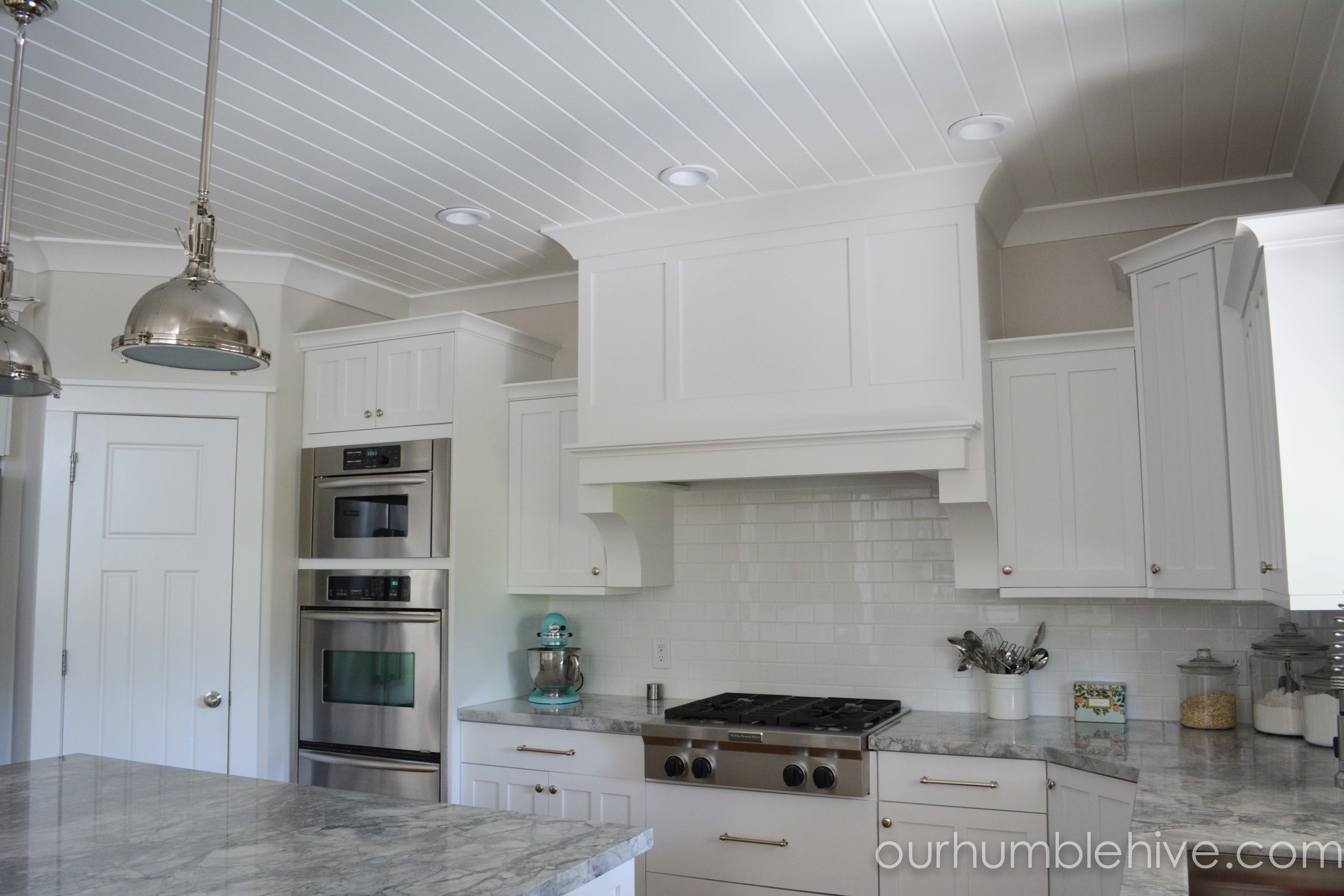
Today I'm excited to share with you our kitchen. We recently updated our home but unfortunately I didn't take very good before photos. I did have a few that I remembered to hurry and take right before our demo. Usually I didn't have my mixer, paper towel holder, and tape measure sitting out on the middle of my island, but this is the best picture I've got. I think you will still be able to get a good idea of the overall design changes.
Before: Kitchen
As you can probably guess from these pictures, I love bright pops of color in my home decor. I also wanted to brighten things up and give my home a farmhouse chic look. To brighten the kitchen I started by painting the existing cabinets white and changing the backsplash to white subway tiles. Then I changed the granite counter top to Super White Quartzite. This was the closest I found to achieve the look of Carrera marble, without the upkeep and care you'd need to take with marble. We also painted the large computer hutch shown below Palladian Blue, which is the color of my front door, and one of my all time favorite colors. We changed the cooktop to a more industrial looking one and changed the sink to a large bowl square sink. I debated on getting a farmhouse sink instead, but I'd heard a lot of mixed reviews about the functionality of farmhouse sinks. I ended up choosing this large square stainless one instead and I've loved it. We changed out the doors to something that I thought looked more cohesive with the cabinet style. I think it really made a big difference on the pantry door.
I wanted my new kitchen to be a place where I could showcase some of my favorite collections. Because of the basic neutral pallet with pops of color, I feel like I'm able to use many of my collections in my decor. It's fun to change them out and decorate with things you love and that have meaning. Above I have my vintage rolling pin collection and some of the unique glasses I collect.
Before: Dining Area
Pictured above you can see the dining area before the remodel. I bought a new dinning table and upholstered bench and chairs. I love the eclectic look of mixing the dining seating.
After much deliberation and at least 12 pints of paint, the color we decided on for the main living area is Pale Oak from Benjamin Moore. I absolutely love how it turned out! I think we found the perfect neutral paint color. It's not too gray and not too cream. I wanted something that looked like linen, and this is it!
Be sure to stop back Wednesday when I will talk about lighting, trim and ceilings.


